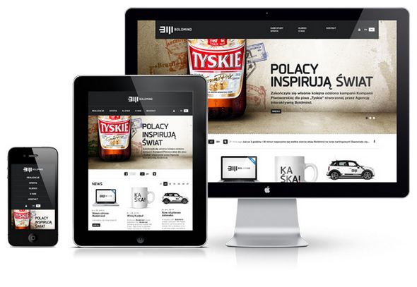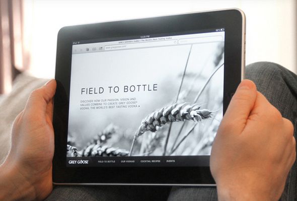
Below is a guest post by a talented designer from Portland, Brian Taylor. Brian talks about the importance of building mobile (specifically, tablet) friendly websites. If you’ve ever had to pinch and twist to read an address or phone number while on your phone, you know how important this is.
However, it is important that you recognize how much of your traffic is indeed coming from mobile users. Using tools such as Google Analytics you can quickly determine if your investment into a mobile site is justified.
On To The Article
Everything revolves around mobile these days. People like to access information from all over the world on-the-go. And the handy tablets that ignited a revolution are making it easier for people to connect with the world – and your site – around the clock.

With more people using tablets for more complex tasks everyday, the need for building tablet-friendly websites has grown to a great extent. Recent statistics say that tablet usage will surpass desktop by 2015. It is therefore important for businesses to create tablet-based websites to avoid driving users away and remain competitive.
Here are some guidelines to help you build tablet-friendly websites:
Analyze Scalability – The Eternal Fold Debate
It is important to judge the ‘fold’ wisely for a tablet-friendly websites. Fold is the point of the website where users need to scroll down to view more information on that page. It is better to provide all the important information and elements on the top of the page before the fold so that users can go through the crucial contents first. Remember that tablet users explore your website in both landscape and portrait positions. Hence, consider various orientations while designing your tablet-friendly website.
Provide Easy-Touch Navigation
The most important thing to be considered while designing a tablet-friendly website is that users use their fingers for navigation rather than a mouse. Hence, the navigational links have to be slightly larger than usual. Tablet users must find it convenient to use the navigational bar on the screen. Make sure to use fingertip-sized buttons for the drop down menus, to help users tap easily. Another option is to offer finger swiping navigational capabilities to browse through the content of your site.
Adjust the Form Fields
Many business websites consist of various forms which may require users to fill necessary details. When these forms work well on normal PCs, chances are there that they may not work correctly on tablets. This is because the entire form may not fit properly on the tablet screen and it may look cluttered and out of place. Users may also require to scroll up and down or left and right to view the entire form. Hence, while designing tablet-friendly websites, make sure you reduce the number of form fields according to the screen size of tablets. Ensure that the forms load fast on tablets by placing only the most required fields.
Use Appropriate Typography

Readability of website content differs for PCs and tablets. Tablets have a smaller screen size than desktops. So, in a tablet-friendly website, the fonts must not be too smll as it may require users to zoom in on the content. On the other hand, the fonts must not be too large since it may require scrolling. Pick up a suitable size of fonts to display the content of your website. The style and color of the fonts matter too. Design your website in such a way that users find it simple and easy to read the contents of your site.
Stay Away from Flash
Beware! Adobe Flash does not work on Apple’s products. If you want your site to be displayed across all platforms, it is better to avoid the usage of Flash in your website. Moreover, the Flash-based elements take too much of time to get downloaded. So, if you are building a Flash-based website, you should consider switching to HTML5 or other technologies that provide equal functionalities of Flash. HTML5 offers a variety of features to create interactive elements and media that work well on tablets and other mobile devices.
Designing a tablet-based website is not a complicated job. Understanding the features of a website that differ in a desktop and a tablet is essential. A tablet-friendly website can be built effectively with careful planning and a good understanding of user behavior.
Author Bio:
Brian Taylor is the Project Manager at Forix, a web design company based in Portland, OR. Forix specializes in web design and development for small, medium and large company websites, as well as e-commerce systems.
